Hand-drawn Data Viz
Grayson White
Math 141
Week 1 | Fall 2025
Dear Data Examples
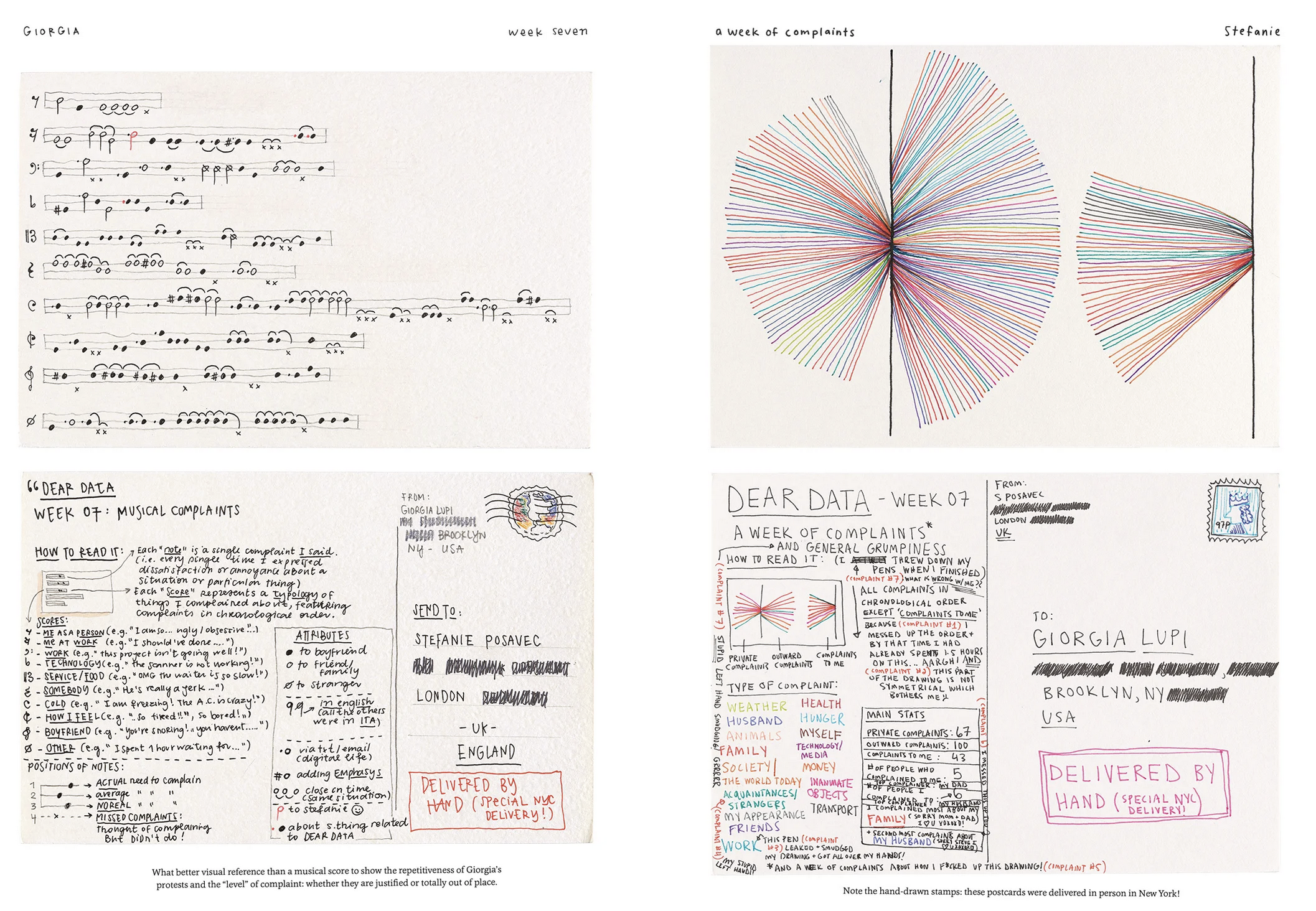
Dear Data Examples
More Dear Data Examples
- Becky Cooper handed out hand-drawn maps of Manhattan to strangers and asked them to “map their Manhattan.”
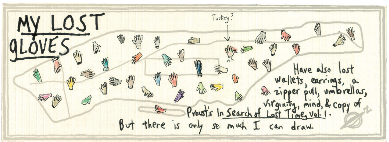
- What would the data frame for this visualization look like?
More Dear Data Examples
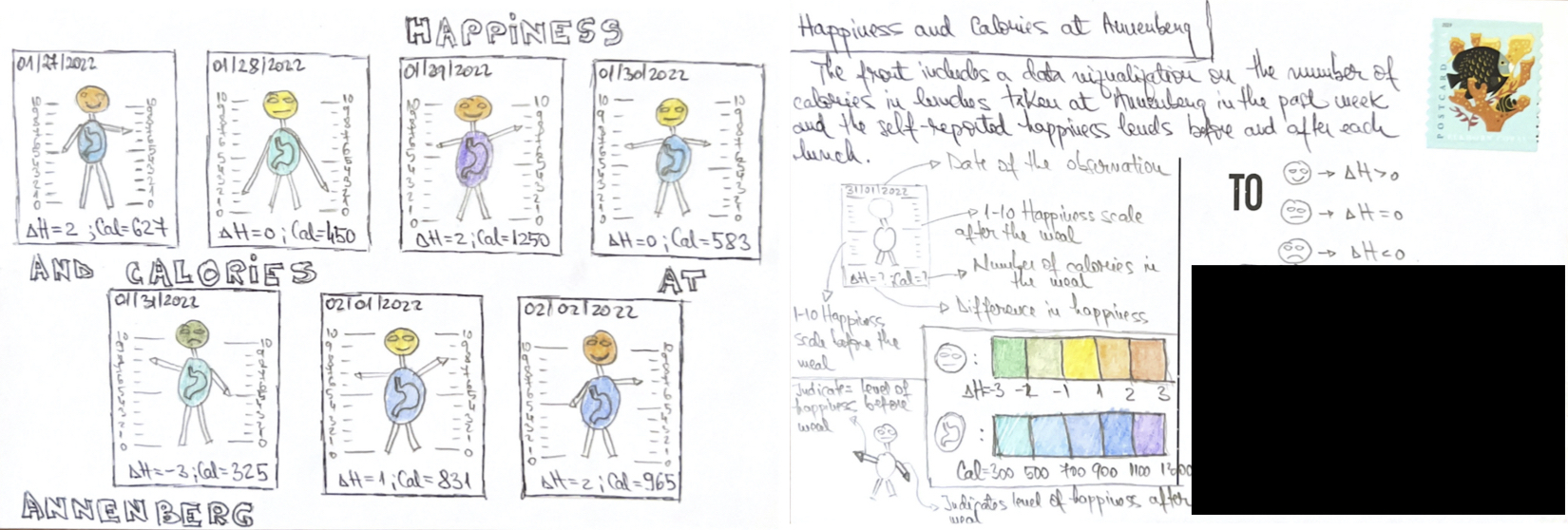
- What would the data frame for this visualization look like?
More Dear Data Examples
- What would the data frame for this visualization look like?